I SEE YOUR TRUE
Colours
Colour may seem like one of the more basic elements of home design, a lower priority when renovating compared to structural changes. In actuality, it has a vivid history, and a deep significance in expressing a homeowner’s personality and style. Lucy Wadelton of Sydney Home Design + Living Magazine spoke with Designer Living Homes’ director, Michael Signoretti, to discuss further.
A VIBRANT HISTORY
Certain colours define certain eras; gold and jewel tones for the 1920s, burnt oranges and yellows for the 1970s, and more recently the ‘Millennial Pink’ that dominated the 2010s. These trends are reflected in the home design of those time periods; 1950s interior design employing bubble-gum pink, baby blue and mint greens while just a decade on featured a psychedelic colour spectrum for 1960s home décor. While colours go in and out of fashion, so do textures and patterns – the 1980s being a prime example of contrasting materials from bold tiles, floral carpets, and clashing wallpapers.
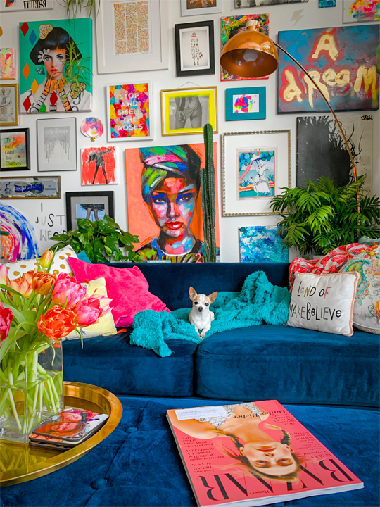
Although recent design trends have steered clear of bold choices and appear to be dictated by monochrome – whites, greys, and blacks – there’s several reasons why homeowners should look to the vibrancy of yesteryear for interior design inspiration. Infusing your home with pops of colour has the added benefit of helping you stand out from the crowd, distinguishing your home from the myriad of cookie-cutter looks. It’s a chance to create an ambiance within each room and ensure that your space is truly customised to reflect your colourful personality.
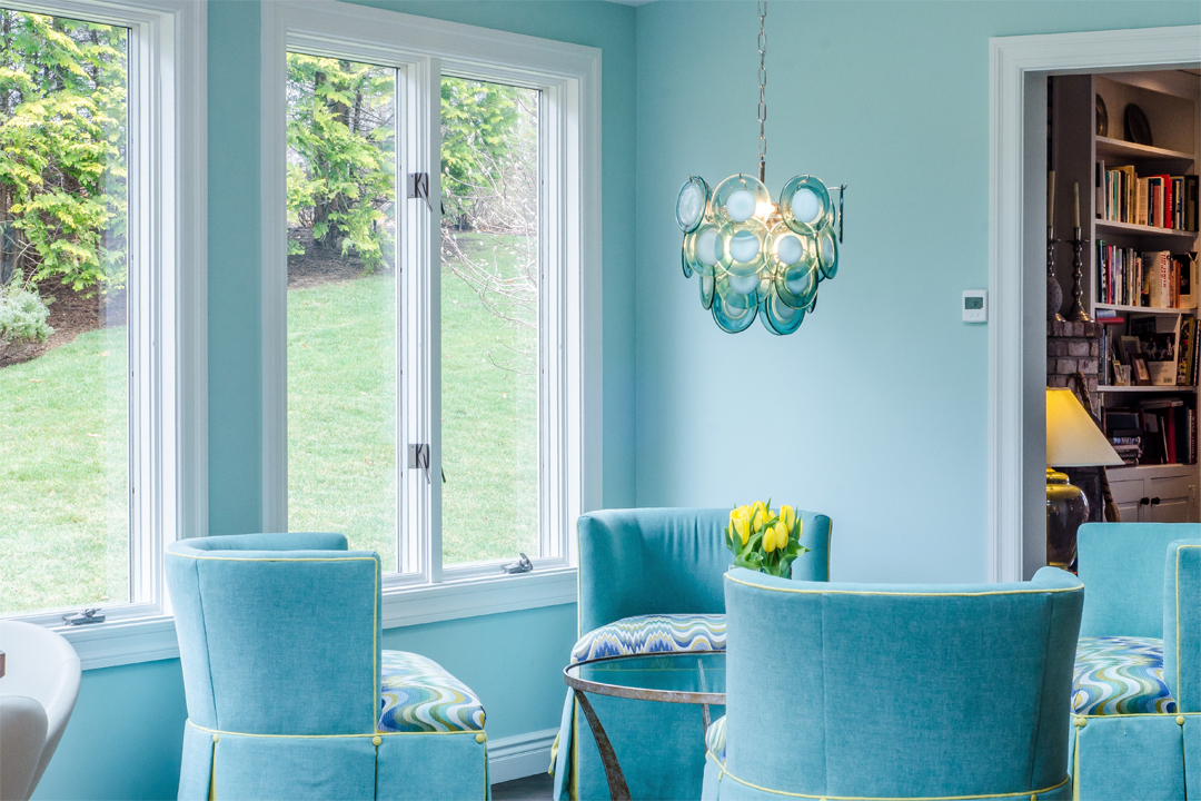
Colours conjure up certain connotations for people – blue for sadness, yellow for happiness, red for rage – but psychological studies now suggest that certain colours impact our emotional states. The Florey Institute of Neuroscience and Mental Health in Melbourne conducted The Taubmans Colour Emotion Study to examine the emotional response more than 700 participants had to colours in living rooms, waiting rooms and blank environments. The results showed that spaces infused with colour were more likely to be perceived as calming and inviting than that of white or neutral tones – particularly soft greens, lilacs, and blues. There’s even reason to believe colourful spaces enhance our creativity and productivity. Your house should be a space you feel most at home; colour is the simplest yet most effective way to transform your space into a safe, character-filled abode.

THE BOLD TYPE
Because colour can set a mood, it’s important to choose a colour palette in your home that can ensure the rooms speak to one another, rather than clash. “Your colour palette can transform your home” Signoretti agrees, suggesting “Maroon with dark timbers can give your home office that luxe feel.” In the bedroom, restorative earthy tones such as olive green can promote good sleeping habits. Warm-toned colours and creams can help make a spa-like atmosphere in the bathroom, while the kitchen is a great space to experiment with dark greens or blues. Ultimately, there’s no right or wrong colour palette in your home – as long as you are true to yourself and are brave enough to try something different.
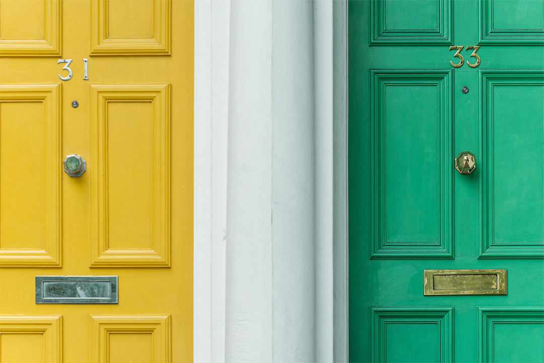
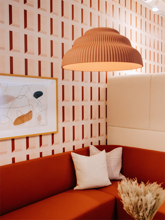
Bold colour choices don’t just have to be done with paint – mosaic tiling, wallpaper, or even colourful carpet or flooring are just some examples of unexpected ways to infuse colour in your home. “Any material can make a statement”, Signoretti attests, suggesting a simple matte white tile to offset a pink pastel accent colour as a minimalist approach to creating dimension in a bathroom. Another example may be a “red carpeted and black walled theatre room” to create the ideal cinematic atmosphere. Wallpaper is an efficient way to introduce colour, texture, and pattern to your home. It’s also an easy way to evoke an aesthetic – from the earthy boho to roaring ‘20s – wallpaper is a fantastic solution. Thinking outside the box can open your eyes to endless colour opportunities, not limited to just the interior of your home either. “If the client wishes to be bold with a façade, the front door is always [a good option]” Signoretti explains, flagging that it’s important to find a balance between bold and simplistic. “You want to make a statement and a focal point of the home” with a pop of colour on the porch, front door or even window trim so as not to look too cluttered.

Homeowners can subtly infuse a dash of colour by bypassing more permanent solutions for choices that can adapt with trends – strategic accessorising. Signoretti attests that taking a minimal approach with paint, but styling with bold colours “can bring your home to life”. Your 70s inspired living room could be complete with shaggy green rug or your retro kitchen can be complete with some pastel appliances – a pink fridge or red oven for instance. Consider painting the walls of your bookshelf multicoloured or filling your otherwise blank walls with vibrant artwork.
THE COLOURS OF YOU
Signoretti’s biggest piece of advice is the “less is more” approach. He believes that its important not to “overload the senses” with too many colours or patterns. “Allow an artwork, feature wall or piece of joinery be the statement and focal point then keep your styling basic to celebrate that one bold piece.” Neutral colour palettes from stark whites to Scandinavian influence have become popular in recent years for its simplicity and versatility, and harmonising bright and exciting features with these tones is a great way to have the best of both worlds.
While Signoretti believes white and neutrals will remain a staple in home design, he is adamant that a person’s home is a true piece of them and should reflect that. “Ultimately a new home is [yours]” he states, “[You] need to create a space you want to be in”. So, although greyscale has its reasons for being timelessly on trend, at the end of the day, “we also need to embrace everyone’s style and need to allow the clients to express themselves through their home”. The next time you’re at your local hardware store, perusing the paint aisle, don’t be afraid to go bold. Your home deserves an infusion of the rainbow, to lift the mood and inspire.

